
Service Business Expert
Marketing Solutions
To Help Your Business Grow
Get your business noticed online
today and let’s make it happen
Service Business Expert
Marketing Solutions To
Help Your Business Grow
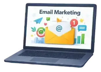
SMS & Email Marketing
Automated Customer Follow-up
Automatically capture leads, request reviews, and
reactivate past customers using simple SMS and email automation.
Turn website visitors into enquiries and keep your business
in front of customers without manual follow-ups.
Lead Capture • Review Requests • Customer Reactivation
No tricks. No spam. Just customer follow-up done properly.
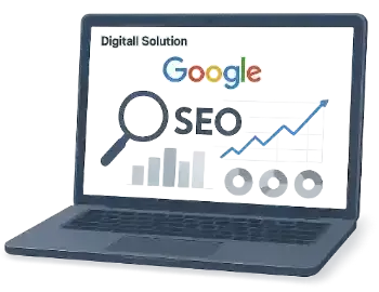
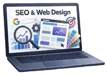
Search Engine Optimisation
Your website should be fast, clean and built in a way Google actually respects.
That’s what I do, no gimmicks, no shortcuts.
I make sure your site is secure, mobile-friendly and easy to manage, then I build SEO around it that brings in the right customers, not random traffic that leads nowhere.
Clear structure. Smart content. Proper setup.
Real results, without the confusion.


How my academy helps you
The Academy is where you learn SEO and website optimisation without feeling overwhelmed, confused or bored out of your mind.
I break everything down into simple lessons that actually make sense.
No jargon. No pressure. No pretending you need to become a tech wizard.
You learn the practical stuff, the things that genuinely help your business show up online and you learn it in a way that fits around real life, not a classroom.
If you want to understand how SEO really works (and stop guessing), this is for you.


Proudly helping small UK businesses grow online
Featured on Google Business, GHL Partner, Local SEO Network
Fully insured with Professional Indemnity, Cyber Liability and Public Liability cover
61 Bridge Street, Kington, HR5 3DJ
Sitemap
Services
© DIGITALL SOLUTION (DIGITALL UK Group) - All rights reserved 2025.